The site has a new design. Ta-dah! It’s more playful than the old one, it sorts posts into three clear subjects, and there’s a handful of rules to guide every styling decision (almost). The process was creatively engaging, but it was also bumpy, and for about a day the live site showed its seams.
In this post I’ll walk through the new design, then what I’d do differently. One caveat first. The stakes here were close to zero. This is a one-person blog with very little traffic, so a day of broken pages wasn’t going to cost me anything. On a site where traffic, revenue or SEO were on the line, I’d go about it very differently.
Why refresh at all?
This site was originally built with just two categories, Main Quest and Side Quests. The titles were a reference to RPG conventions, to reflect my journey in building the site. But as the corpus of content grew, it became clear that they were too broad to be navigationally useful.
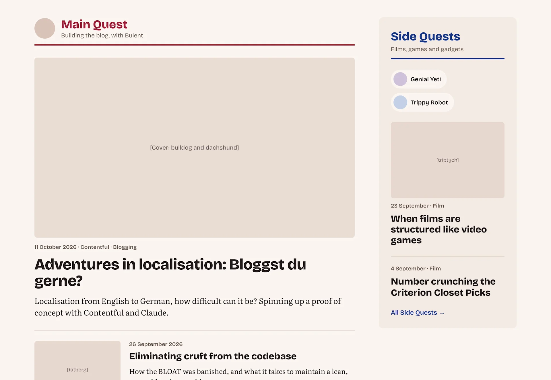
While hashing out some prototype designs, the first idea that stuck was to colour-code posts by author. The site nominally has three writers, myself plus two mascots who cover films and games, so three colours would sort everything.
I liked the colour-coding concept, but sorting by author was the wrong application for it. This site is topic-driven, and I imagine someone reading a film essay or a hardware build doesn’t care too much about which person wrote it.
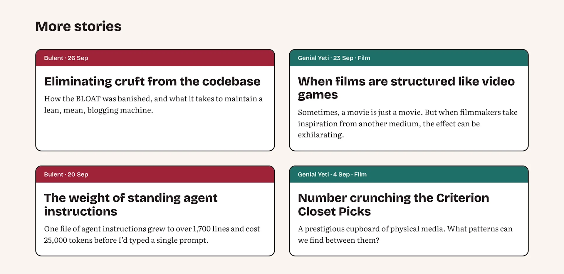
So where it settled was that posts now sit in three strands, Blogging, Films, and Games & Gadgets, each with its own colour.
But addressing the categories was half of it. The other half was how much structure sat around them.
The analytics gave me a clue. Traffic here is small, so treat this as an observation, but nearly nine in ten visits stop at a single page. Hardly anyone browses.
The first version of the site laid out its whole structure, with index pages for categories and authors. That made sense as a baseline. Once I saw that people weren’t moving around, the index pages looked like dead weight, so the smarter play was to trim them back and put the posts up front.
So the landing pages for categories and authors are gone, and their old addresses redirect. Each author still has a page of their own, with their bio on it, now linked from the footer, alongside other ways to navigate, like tags and the archive.
Designing by reacting
I'm not a designer, and I don't have the vocabulary to describe a design from scratch. What I can do is look at two options and say which is better and why I like it.
The design work happened on a shared board with Claude, with mockups of each direction laid out side by side, some filled with real posts and cover images. I left comments directly on the mockups – a drop shadow that felt too heavy here, a font that felt wrong there – and each round came back revised.
Where words failed me (occasionally it happens), toggles on the board let me flip between versions and pick by eye. The loop worked well, especially when I could sit with a design for a couple of days and then pop back in with more ideas we could try.
The rules behind the design
The homepage opens with the newest post as one big card, then a grid of earlier posts. Across the top sit four big buttons, like pressing "enter" on a mechanical keyboard. Click one and the page narrows to that strand, with its button pressed in.
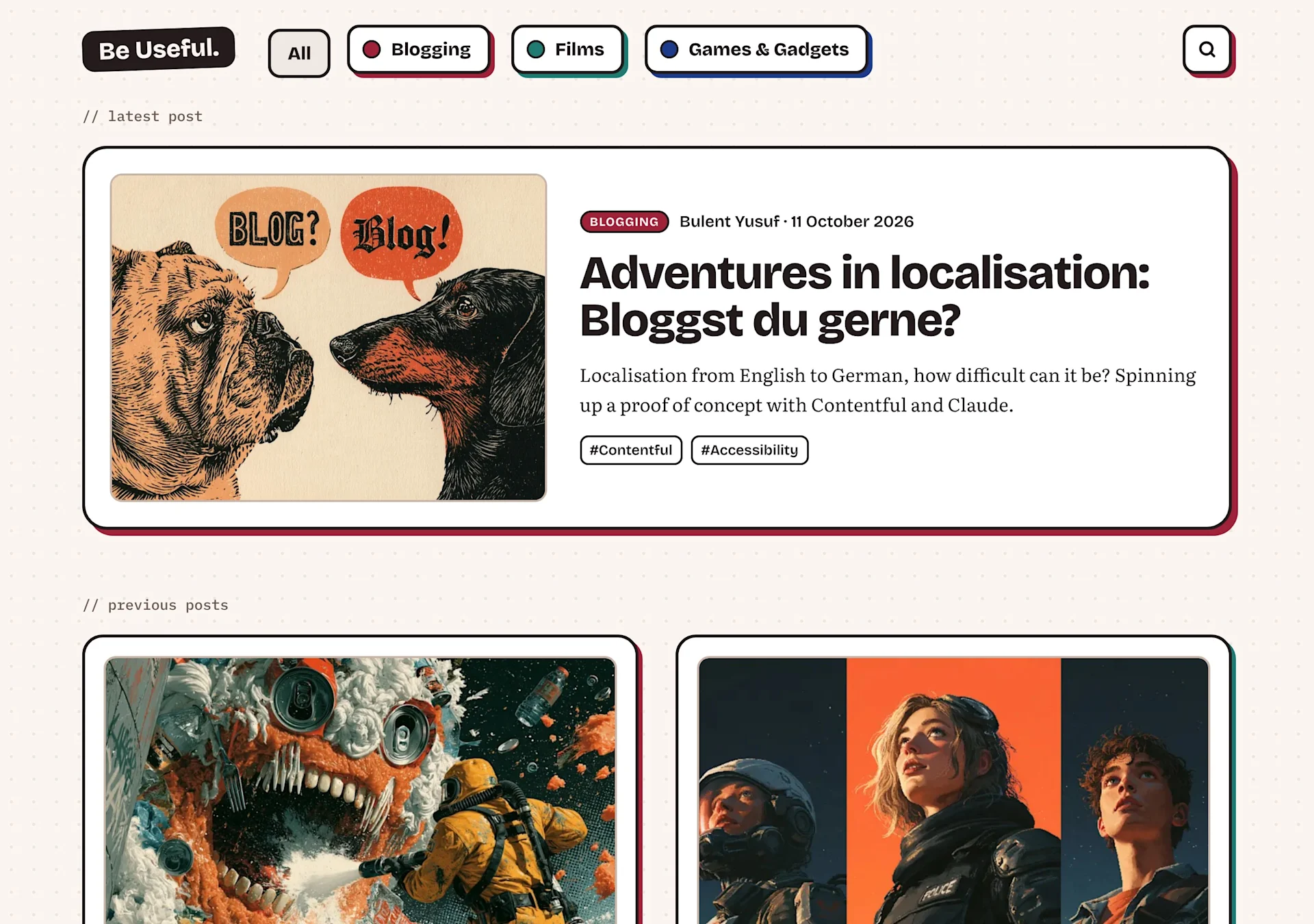
A short list of rules decides almost every styling question on the site. When a new component comes up, these get applied before anything is invented.
A shadow implies tactility: Anything you can click sits on a hard drop shadow, and presses into it when you hover, like pushing a physical button. Post cards, strand buttons and the search button all qualify. Plain text links never do, and neither does the logo. It links home without a shadow, so it never reads as a second home button beside All.
Reading is flat: The same rule means holding back where it matters. Inside a post, the title, cover, article text, tags and author card have no shadow at all, so nothing competes with the words.
Colour marks the subject, and nothing else: Each strand has its own colour, crimson for Blogging, teal for Films and navy for Games & Gadgets. It shows up on a post's label, its card shadow and the strand buttons, and nowhere else. A film piece I wrote is teal like any other Films post. Every label also spells out the strand's name, so colour is never the only signal, which matters for anyone who struggles to tell crimson from teal. Links stay crimson everywhere, with a permanent underline inside articles.
Sticky tape and tilted objects, used sparingly: Every handmade touch should say something about how the page is put together. A tilted component implies relaxed and idiosyncratic, so only the logo, the numbered section stamps and the gremlin on the 404 page are tilted. Sticky tape means something is pinned beside the content, so the one taped panel is the table of contents on wider screens (the list of section links that stays in view as you scroll down a long post), held to the page by a strip of yellowing plastic.
Three typefaces, each with one job: The Bricolage Grotesque font handles headings and buttons, and Literata handles anything you read at length. IBM Plex Mono is kept for machine-style text, like small labels and code. Giving it that one job stopped two different sans-serif faces clashing in the same line. Plex Mono was chosen because its proportions sit closest to the other two.
The cast takes a peek: The three authors, myself and the two mascots, peek over the top of the footer and pop up when you point at them. It's a silly little flourish and completely unnecessary, but I love it to bits.
Dark mode is charcoal: Dark mode sits on a neutral charcoal. Warmer versions came first, and they read as brown and heavy. The new palette is colder but less overbearing.
Checking the graph paper
The dotted graph-paper background is the part of the new design I like most. It also raises a fair question, whether text sitting on a pattern stays as readable as text on a plain page.
Automated accessibility checkers can't answer that by themselves. They judge contrast against a single background colour, and a field of dots isn't one colour, so they mark every check on the page as inconclusive.
So the site's audit measures what a reader actually sees. It takes two screenshots of each page, one with the text and one without, and checks the background under every letter against the colour of that letter. It runs at desktop and phone widths, at a larger font size, and in dark mode.
Every type of page on the site passes the standard contrast threshold for body text (WCAG AA, a ratio of 4.5:1), dots and all. This is the riskiest part of the design, I feel, but it's just on the right side of accessibility standards to stay in place.
What I'd do differently
A) Don't settle on the first design that impresses you
When a mockup looks good, it's tempting to stop exploring and start polishing. A design that impresses on the homepage can fall apart on a post page or a search page, and you won't know until you've seen it there and compared it with the alternatives.
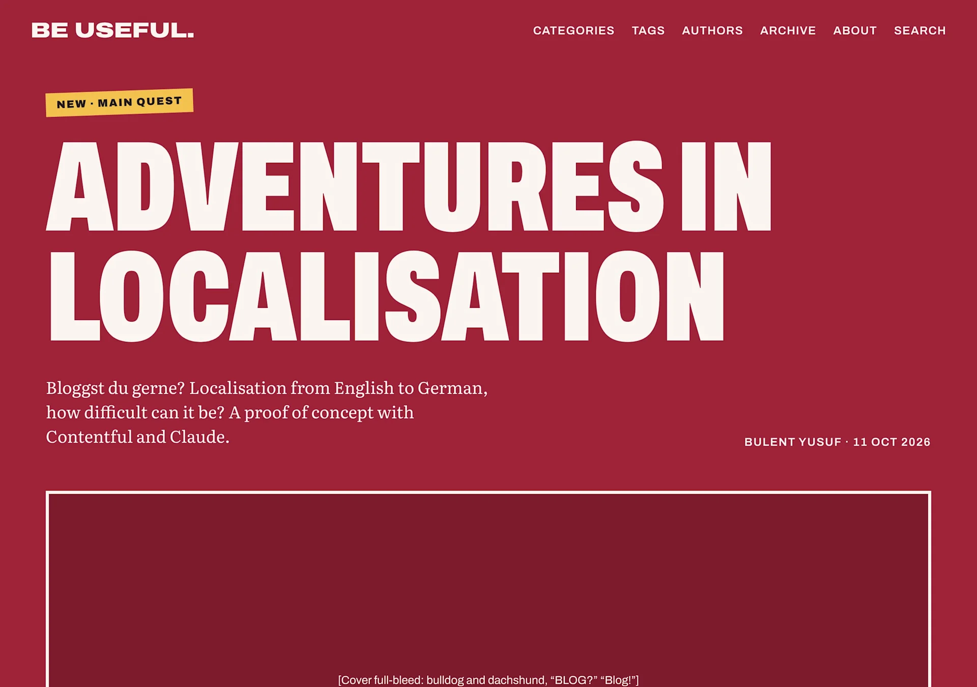
Explore as many directions as you can. Pin the ones you like as you go, then make the final choice from the pinned set, once you've seen enough to know what you're choosing between.
B) Lock the design before you build it
I started building before the design was finished. The build went out as a relay of small changes, one part of the site at a time, while design decisions were still being made. So decisions kept landing mid-build, and each one meant reworking something already shipped.
What was missing was a check between signing off the design and building it. Next time, I'll list every page type (home, strands, posts, archive, search, tags, authors, about and the error page) against phone and desktop, and light and dark mode. Then I'll add the especially awkward content, like a post with no cover image or a very long title.
Every cell in that grid should get a finished mockup, or a note saying it matches another one. A blank cell means the design isn't ready to build.
C) Stage the whole redesign first
Because each small change went straight onto the live site, a reader might see every half-finished stage. For nearly 24 hours the site had mashed-up bylines, two fonts squabbling for ascendancy, garbled navigation, and page types left half-converted to the new design. Sidenotes (short asides appearing beside the text) were cut from the content model, too, while German translations hadn’t fully caught up with the new design.
My hosting service builds a private preview of every change before it goes live. But each change was rolled out as a small pull request that the following pull request was designed to build upon. A sequence of dependencies made having the full picture in draft mode impossible.
So yeah, if I were to do this again, I’d build the entire redesign on its own branch, a separate copy of the site’s code that the live site ignores. Every change lands there, and the branch gets its own preview address that shows the whole redesign as it comes together. Meanwhile readers keep the old site, intact and unremarkable, for as long as it takes.
A branch only isolates code, though. The content model, meaning the content types and fields the CMS holds, is shared between the live site and the branch. This redesign deleted the sidenote content type and removed fields like the category thumbnail, which meant regenerating the starter content that ships with the template version of the site that anyone can fork for themselves. Changes like those can’t wait on a branch, so plan them for the moment you switch over.
When every page looks right, and not a moment before, one merge folds the branch into the live code and the whole site changes at once. The QA happens on the preview, and visitors only experience the before and after (blissfully unaware of the scaffolding between them).
Learning a new craft
I said "if" I were to refresh the look of the site again. But really it's a matter of "when".
Because it was super rewarding to put together a bunch of prototypes and chip away at the most promising one until it became serviceable. There's a new discipline I'm discovering, balancing the impact of webpage design with making it functional, and a place you'd want to visit daily.
The next design refresh, though? That one starts on a branch.
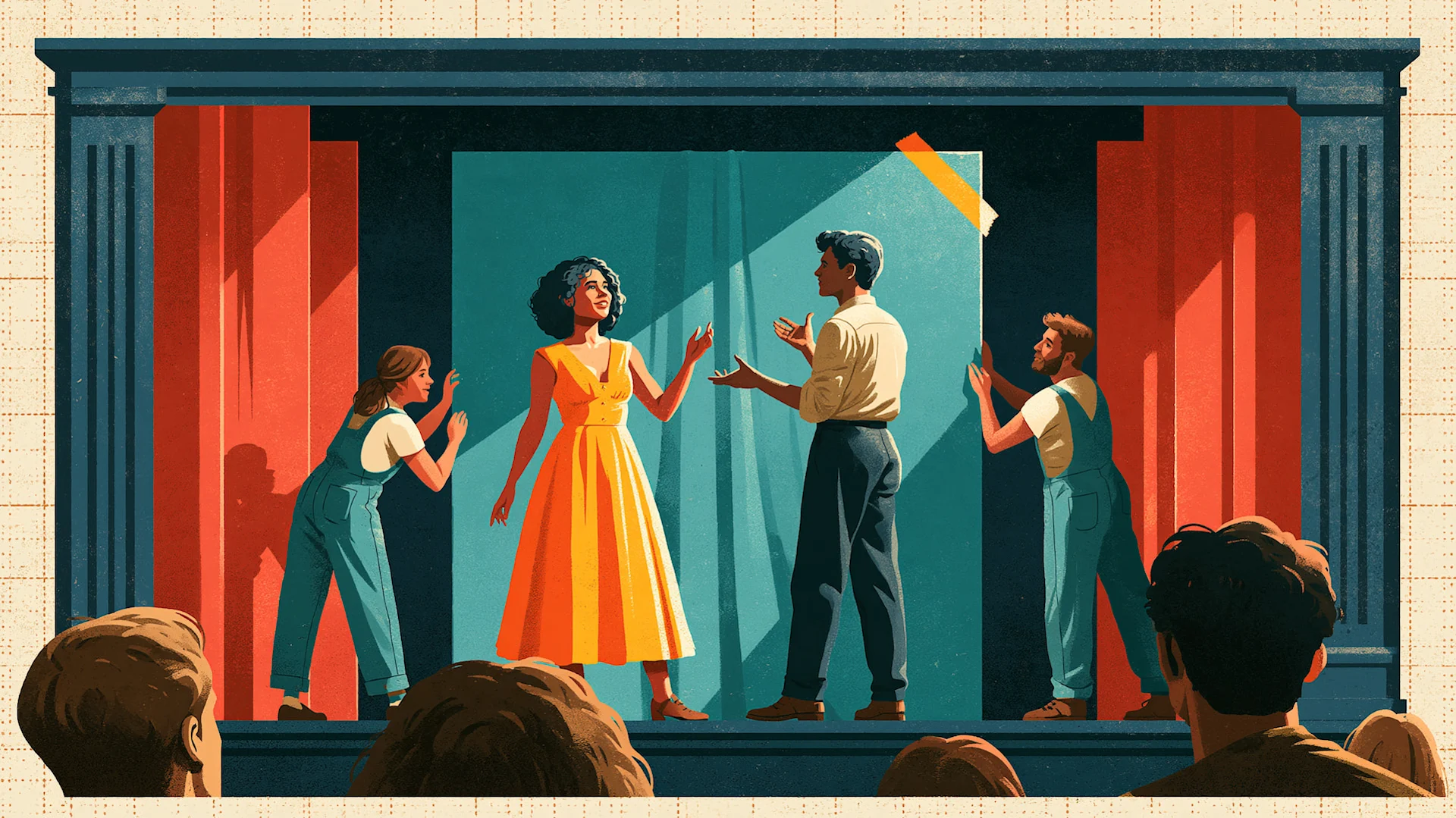
flat graphic illustration of a small theatre stage mid-performance framed by a navy proscenium, two performers centre stage, a woman in a bright yellow dress and a man, mid-gesture, while two stagehands in overalls, a woman and a man, push a teal backdrop panel into place behind them, a strip of yellow tape on the panel's corner, crimson side flats, the backs of a few audience heads in the foreground, cream border with a faint dotted graph-paper grid, bold flat colour blocks, hard shadows, playful and tidy, neobrutalist poster style
written by
Bulent Yusuf
Bulent is a content marketer by trade and writes everything here that isn't films or games (which turns out to be most of it). He doesn't think speaking about himself in the third person is the least bit weird. Born in the UK, Turkish Cypriot heritage, living in Germany.